Outcomes
- Platform transaction volume: +73% year on year. Users doing dramatically more inside Lunar.
- ARPU: +12% across personal and business banking, with revenue mix shifting structurally away from interest income.
- Paid tier conversion: 1 in 2 new users on a paid tier within their first week.
- Navigation-related support calls: −41%, scoped specifically to the IA and navigation fix.
- Scale and quality: Preceded Lunar passing 1M users across Denmark, Sweden and Norway. App store rating moved from 4.2 to 4.7.
Outputs
- A reframed brief: Diagnosed the project as a primary-bank rebuild rather than a surface redesign, and built leadership alignment around three structural problems (ownership, debt, brand) that had to be solved together.
- A new product architecture: Daily versus situational split as the organising principle. Seven rounds of low-fidelity prototyping, four concept directions plus a deliberate fallback, and a pivot that killed an ambitious pattern (Spaces) while keeping the thinking that made it work.
- Matter design system: A rebuilt token-backed system with code reflection, governance, and theming, supporting Consumer, Business, Kids, and the SAS partnership without rebuild two years on.
- Brand and product in one system: Brand decisions held at the token layer, so changes propagated rather than rippling manually. The product collaboration shaped the brand as much as the brand shaped the product.
What is Lunar?
Lunar is Scandinavia's leading challenger bank, serving over one million users across Denmark, Sweden, and Norway. Founded as the antidote to traditional banking: quick to use, simple to understand, designed around how users actually want to bank.
I joined in 2023 at a turning point. The fintech VC market had cooled, the board wanted profitability rather than growth, and strategy shifted from marketing-first to product-first. Marketing wasn't the problem; Lunar was good at attracting users. Retention was. Most users treated Lunar as a fun money account or a second bank, not as their primary one, and the profitability maths only works if Lunar is the bank where your salary lands.
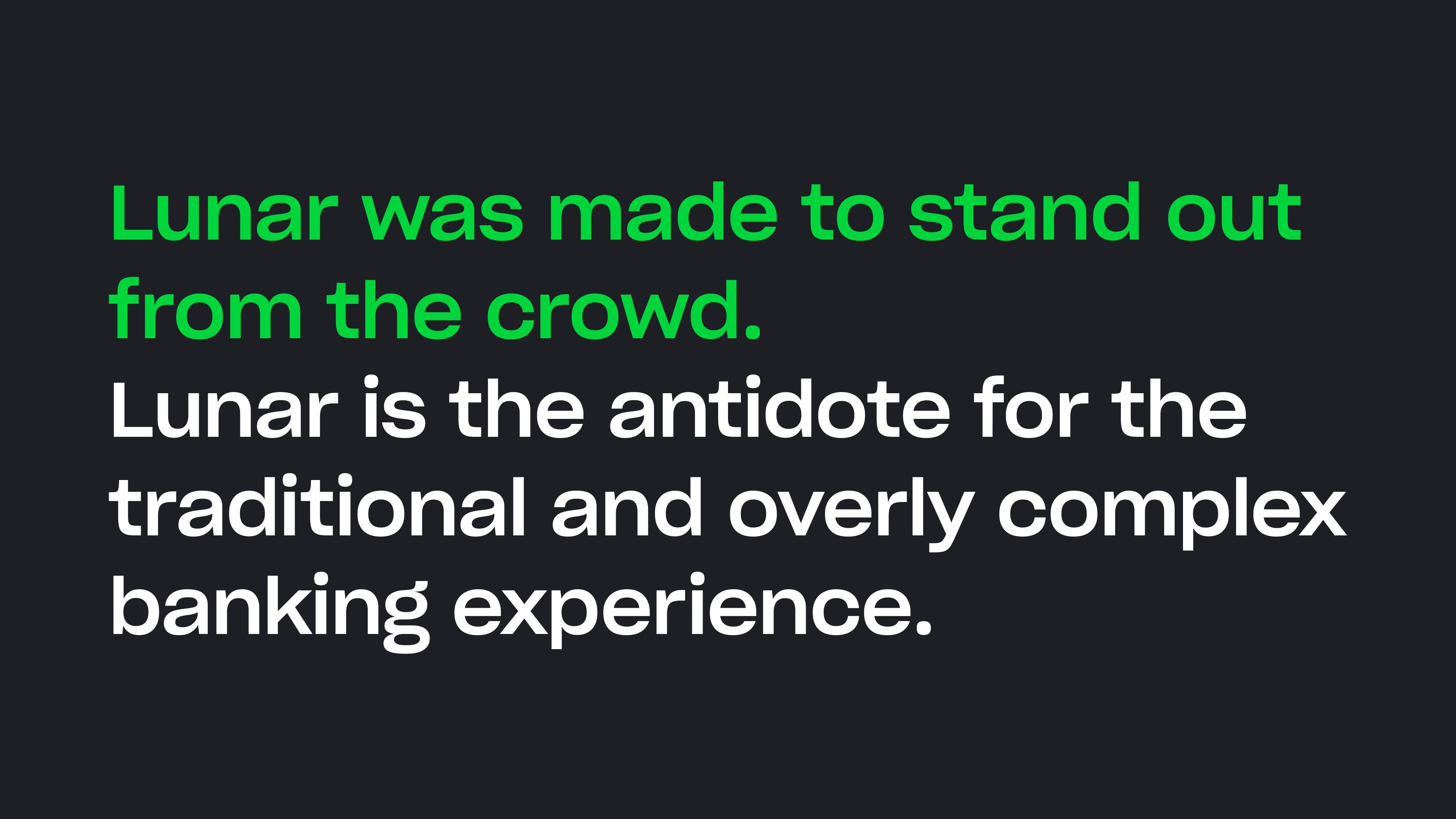
So this wasn't a redesign in the conventional sense. The job was to rebuild Lunar as a primary bank. Lunar's original mission, "the antidote for the traditional and overly complex banking experience", was still on the wall. The product had drifted a long way from it, and the project was about putting that mission back at the centre of the experience.
My Role
Head of Product Design at Lunar from 2023. On this project I stepped into the lead designer role on the core experience team, owning the early IA, the prototype rounds, and the system architecture decisions, alongside a senior product designer and an engineer-heavy team. The shape was deliberate: small team, fast decisions, engineers in the prototyping work from the start rather than after.
A note on framing. I was in a Head of role, but Lunar had a strong "everyone is hands-on" culture, so I led this as the lead designer in the work, not from above it. The IA, the prototypes, and the system decisions were mine. I've called this out up front because it's a fair question to ask.
Diagnosing the Real Problem
One of the first things I did when I joined was set up a closer relationship with the customer care teams. They sat closest to the actual problems users were dealing with, and that channel hadn't been wired into design and product. These quotes came out of one of their reports, captured because the team was hearing them constantly across all three markets:
"It should be simpler. After five years, I still struggle to find my way around."
"The home screen is too busy. Important features are buried in sub-menus."
"Unintuitive and unappealing compared with Revolut, Monzo, and Starling Bank."
Lunar had become the thing it was meant to fight against. The antidote to complex banking had become complex banking, with a smaller feature set than the banks it was supposed to replace.
Before the project was on the table, I'd already kicked off a customer journey map for the whole experience. Lunar didn't have a holistic view of how users moved through the product, and I wanted one to inform design strategy and quarterly planning. The work mixed diary studies and panel interviews across all three markets with Looker data work pulling together what was already scattered across squads, marketing, and support. Most of the inputs already existed somewhere in the business; they'd just never been put next to each other.
It was the first time anyone at Lunar had seen the experience as a single thing. Once it was assembled, the problem wasn't deniable, and it revealed three structural problems sitting underneath the user complaints. Each one needed a different fix, they compounded each other, and the project had to address all three.
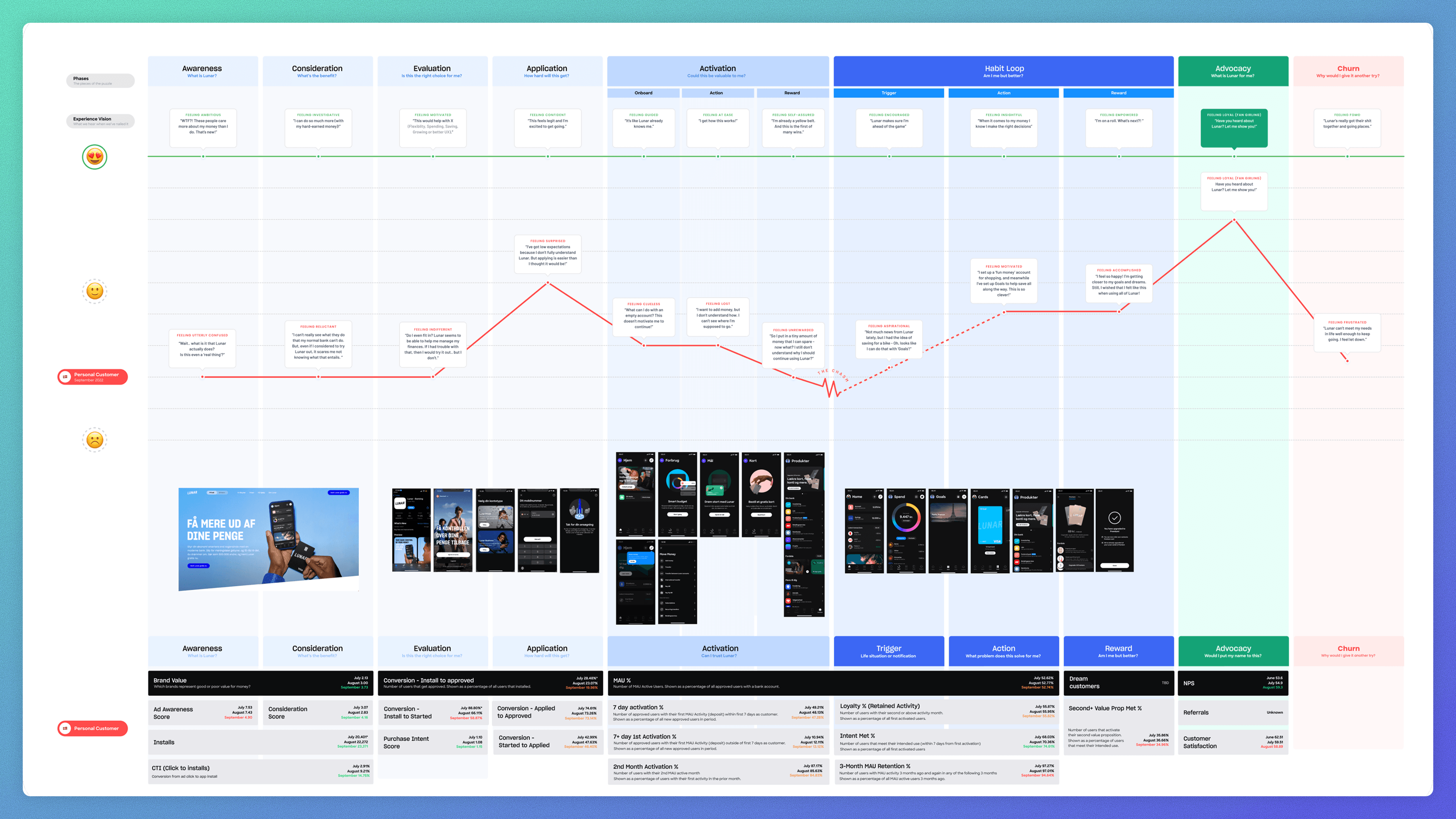
Ownership
Every squad treated the home screen as their real estate. Tabs accumulated, promotional slots multiplied, features got added without anyone asking what got displaced. By 2023 the CEO couldn't name what every team was working on anymore. Several product areas were left half-built because squads moved on chasing the next quarterly objective. Each decision in isolation made sense for the squad making it. The problem was that holistic improvements weren't anyone's job.
Debt
Lunar had a design system. It had been built by a dedicated designer, and as a Figma artefact it was good: comprehensive, plenty of variants, solid documentation. The problem was that it had been built in isolation from how it was actually used. A single list component had twenty-something props, tuneable to any imaginable case. That's not how designers work under product pressure. They grabbed the component, ignored most of the props, detached it, tweaked it, and shipped. Each squad ended up with its own personal version of the system, drifting separately. The system was being followed and still producing inconsistency.
It also had no relationship to engineering. No tokens, no code reflection, no governance loop. Even when designers used it correctly, the production code was maintained separately, and the product still drifted from the source.
Brand
Lunar's marketing brand was at its best in 2023. Distinctive voice, confident colour, a clear position as the antidote to traditional banking. Then users opened the app, and it was like a different company. The brand voice that worked so well externally didn't survive the boundary into the product. Inside, the language was generic, the visual treatment muted, the personality gone. The cause was structural: brand and product had grown up as separate functions, with separate teams, roadmaps, and visual systems. Neither team was wrong. The seam between them was.
Putting the Pieces Back in Order
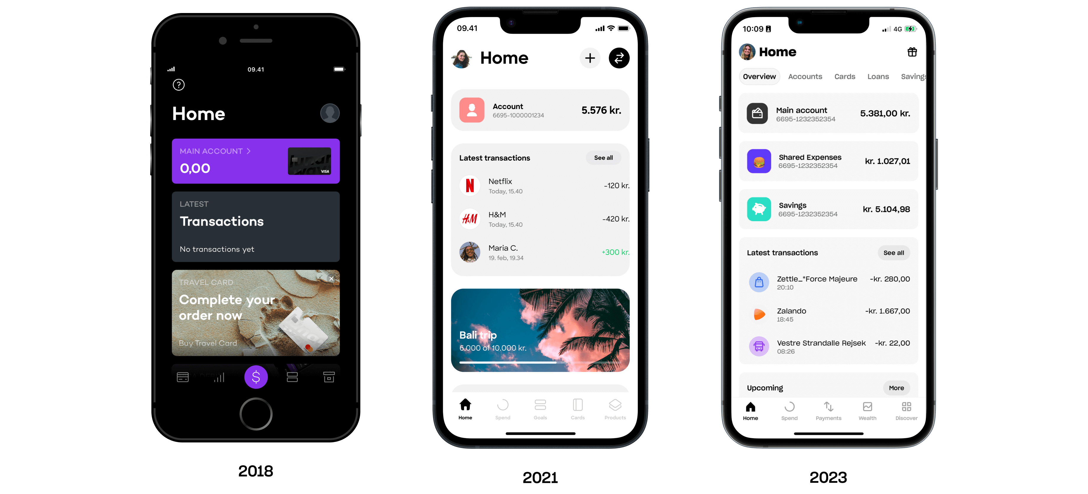
Once the diagnosis was clear, the first design decision was about how to organise what we already had. Lunar's product had grown by addition over time. We weren't starting from scratch; we were reorganising existing material against a clearer model.
I set the project up with a small core experience team rather than putting it inside a feature squad, and gave us four working principles up front: simple, focused, inclusive, delightful. They became the decision filter for the trade-offs that came up across the project.
Then I ran a workshop where we put every existing feature on the wall and bucketed them against jobs at specific lifecycle stages. Daily banking. Making a large purchase. Having kids. Saving. Getting paid. Paying others. Sharing accounts. The stages came directly from the diary studies and co-design sessions, so they reflected how users actually thought about their money rather than how Lunar had organised its product team.
Two things became visible immediately. Certain features were doing daily work: accounts, cards, transactions, payments. People needed these every time they opened the app. Others were doing situational work: loans, large savings products, currency exchange. These mattered when they mattered, but they shouldn't compete for attention with daily jobs.
This split became the foundational principle of the redesign. Daily banking is what you take your phone out of your pocket for. Supplementary products are what you find when you need them. The existing app didn't honour it; every feature competed for the same real estate regardless of how often anyone actually needed it.
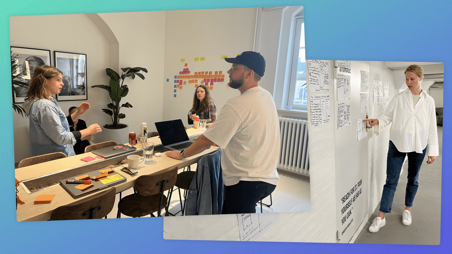
Prototyping in the Open
I ran seven rounds of low-fidelity prototyping with the team across about two weeks, three to five iterations per round, with designers and engineers in the room together. Pace was the point. Anything that took more than a few hours wasn't a prototype, it was a commitment.
Every part of the app got worked through, not just the hero flows. The model only holds together if it works at the edges. You can design a beautiful home screen, but if the loan flow, the help centre, and the savings detail break the mental model, the model is wrong.
Each prototype that mattered got tested before we moved on. What changed across rounds was who we tested with: new users for onboarding, investment-heavy users for high-engagement directions, joint account holders for shared finance, basic banking users for the daily core. Matching the user to the goal meant each prototype got pressure-tested by the kind of user it was actually designed for.
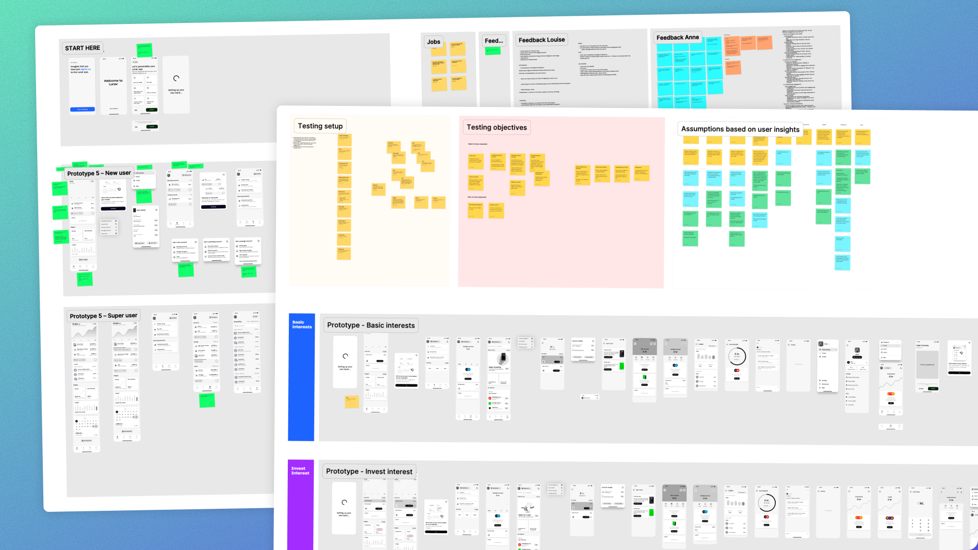
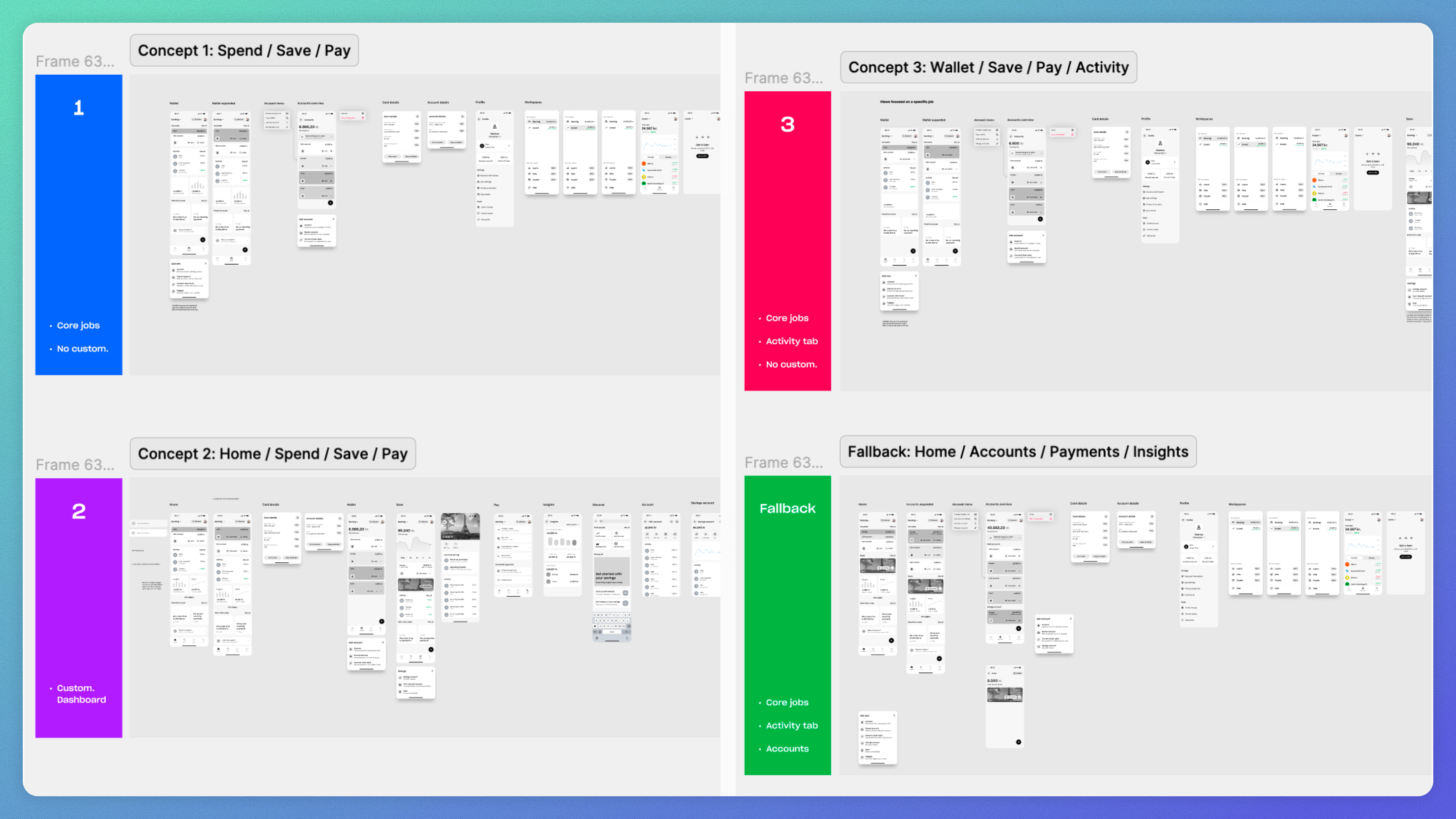
By the end, we had narrowed to four concept directions worth taking further, plus a deliberate fallback worked through to the same depth:
- Spend Save Pay. Pure core jobs, no customisation. Simplicity wins outright.
- Home Spend Save Pay. Same core plus a customisable dashboard.
- Wallet Save Pay Activity. Core jobs plus a dedicated activity tab.
- Spaces. A switcher between mental contexts (Daily banking, Invest, Crypto, Help), each its own focused experience. This one came out of the co-design work, not the IA prototyping. Rather than picking a tab structure for daily-versus-situational, Spaces let users switch between the mental contexts they'd shown us themselves.
And then the fallback. Home, Accounts, Payments, Insights. The safe answer. A familiar pattern any banking user would recognise immediately. Deliberately less ambitious. Worked through in full so we knew exactly what the floor looked like if the more ambitious concepts failed.
Spaces, and Why We Cut It
By the end of testing, an IA concept we called "Spaces" had emerged as the strongest answer. A switcher between mental contexts (Daily banking, Invest, Crypto, Help), each with its own focused experience. It served two audiences the others couldn't: daily banking users could ignore the rest, and the small but profitable group of investment-heavy users could live in their preferred mode. It looked like the right answer.
Engineering pushed back hard, and not just on technical complexity, though it was technically hard. They didn't like the prototype. I read that as a taste objection and assumed we'd persuade them once the interaction was polished. On reflection, that was the wrong call. Engineering pushback on complexity is sometimes a feasibility signal, sometimes a taste signal, and sometimes a structural signal about whether the model is actually sound. I should have weighted theirs as the third.
What forced the issue was platform divergence. Spaces was buildable on Android, but on iOS the underlying logic layers made it materially harder, and we were heading toward shipping two meaningfully different experiences on the same product. That was the real risk. Not the timeline. The divergence.
So we cut Spaces as a navigation pattern, but kept the thinking. The user job was real, so we redistributed it across a flatter architecture. Investments became its own primary navigation slot. Loans went into Wallet, where they gained better contextual discoverability than in any version. The most important inheritance was Wallet itself: it started this project as a flat list of accounts and shipped segmented by behavioural context. That structure is Spaces thinking, expressed at the right scale. The exploration paid for itself in the architecture, even though the pattern didn't ship.
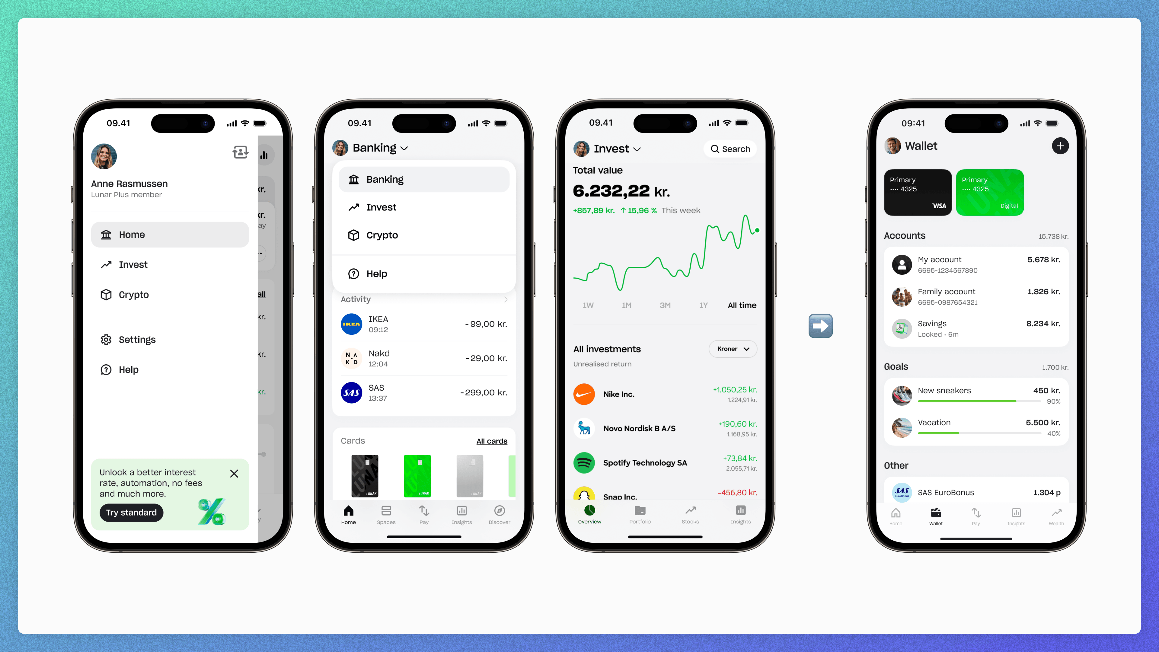
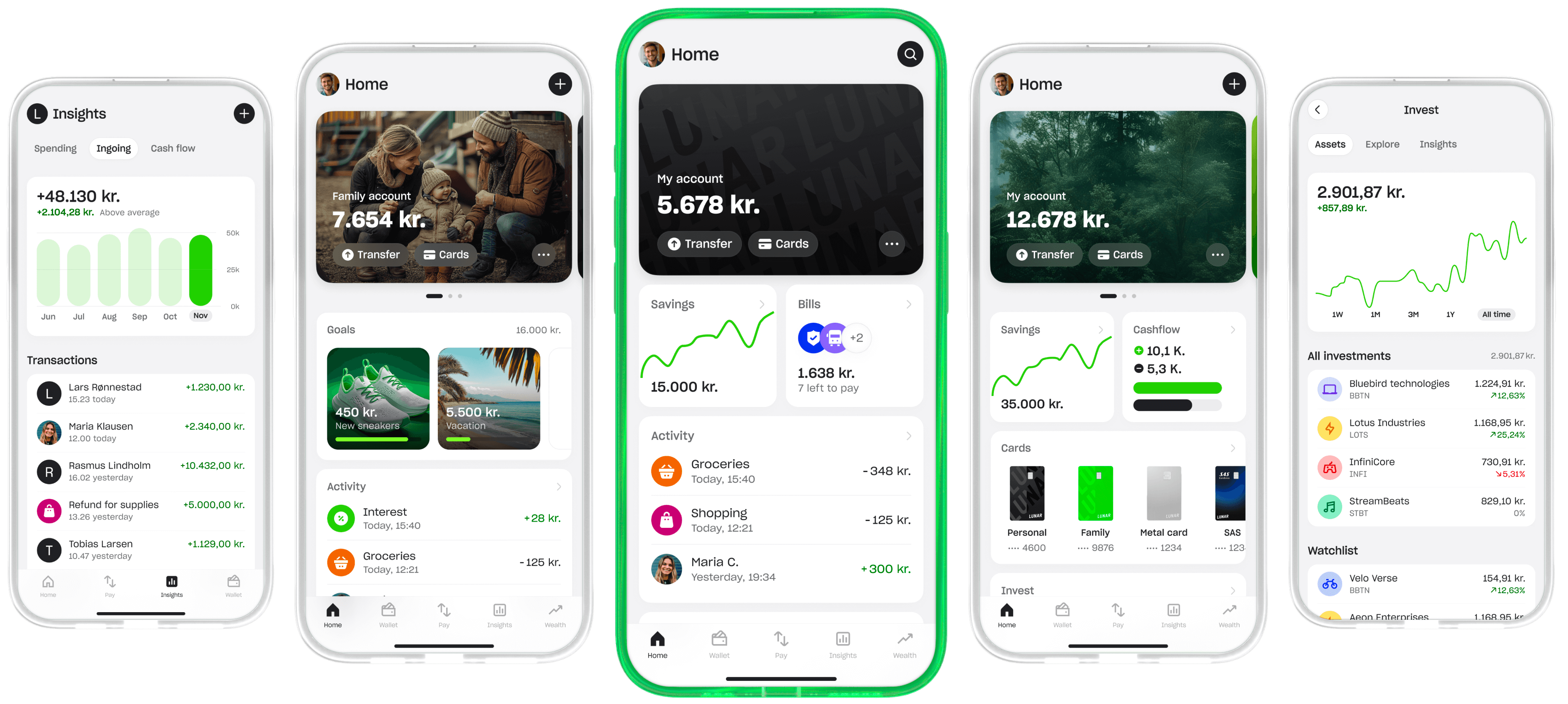
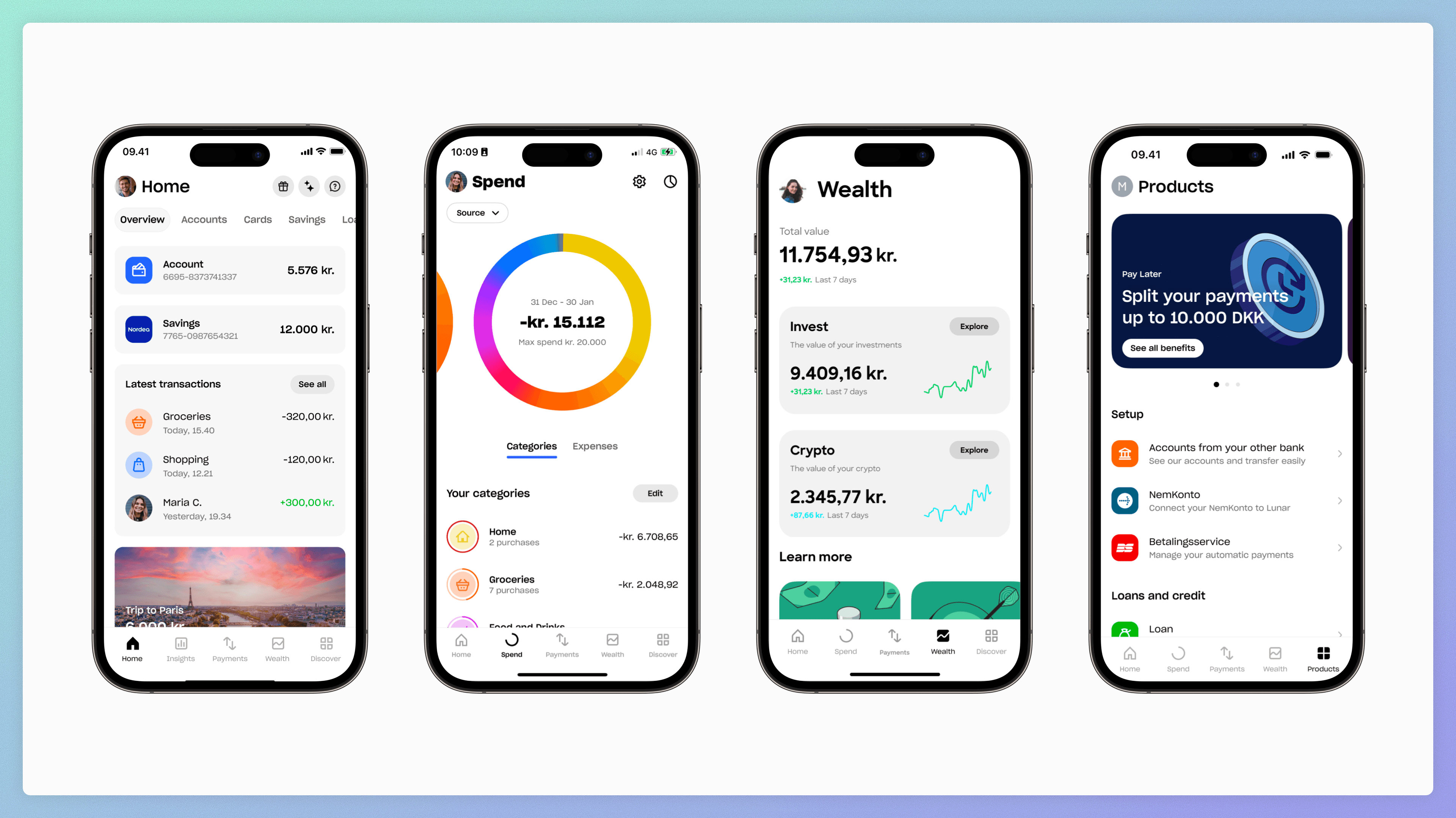
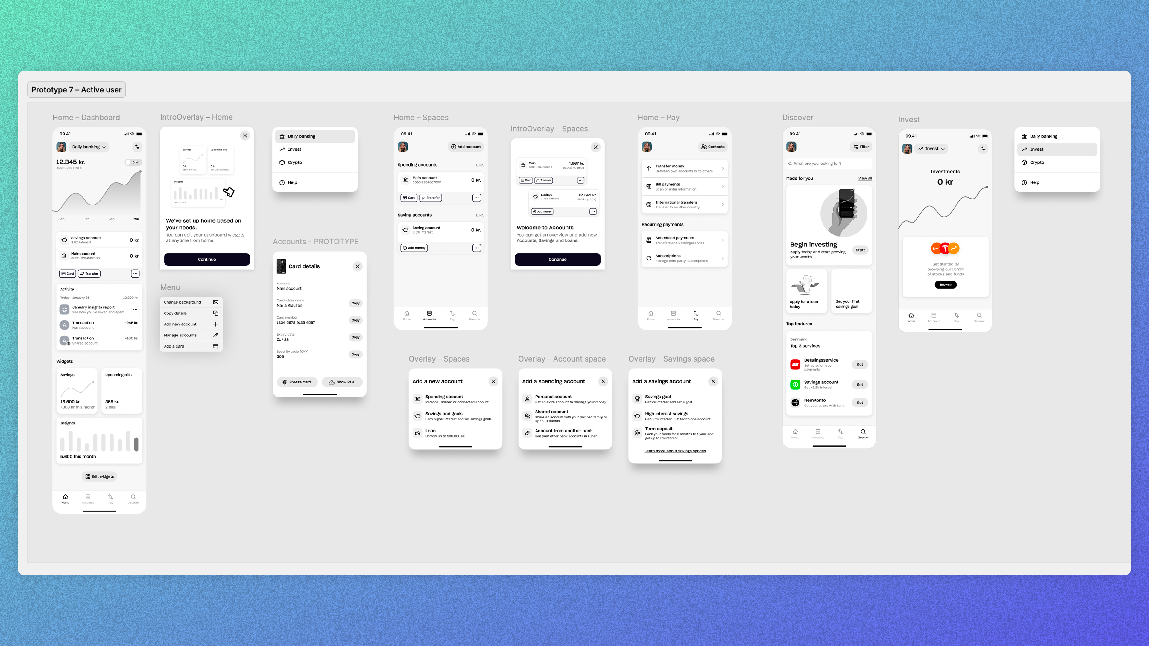
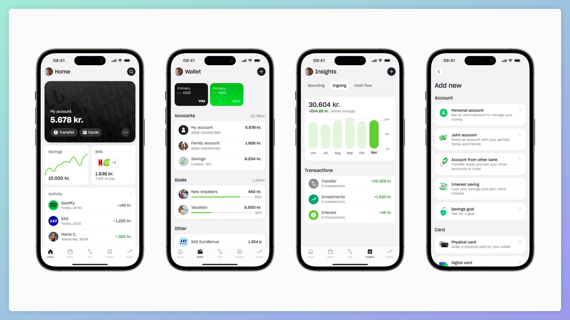
The Shipped Product
Same daily-versus-situational split from the discovery work, expressed through a flatter architecture and a different idea about what customisation means.
Home is the focused daily banking experience. Primary account, recent activity, the widgets that mattered most. Wallet is the comprehensive overview of all financial products, segmented by how people actually use them. Insights gives users a clearer picture of their money over time. Adding new products is contextual, surfacing the right options in the right moment.
We also reframed customisation. Spaces had treated customisation as an IA-level decision: what context am I in. The shipped version treats it as a personalisation decision: what does my Lunar look like. Lighter weight, less burden on the user.
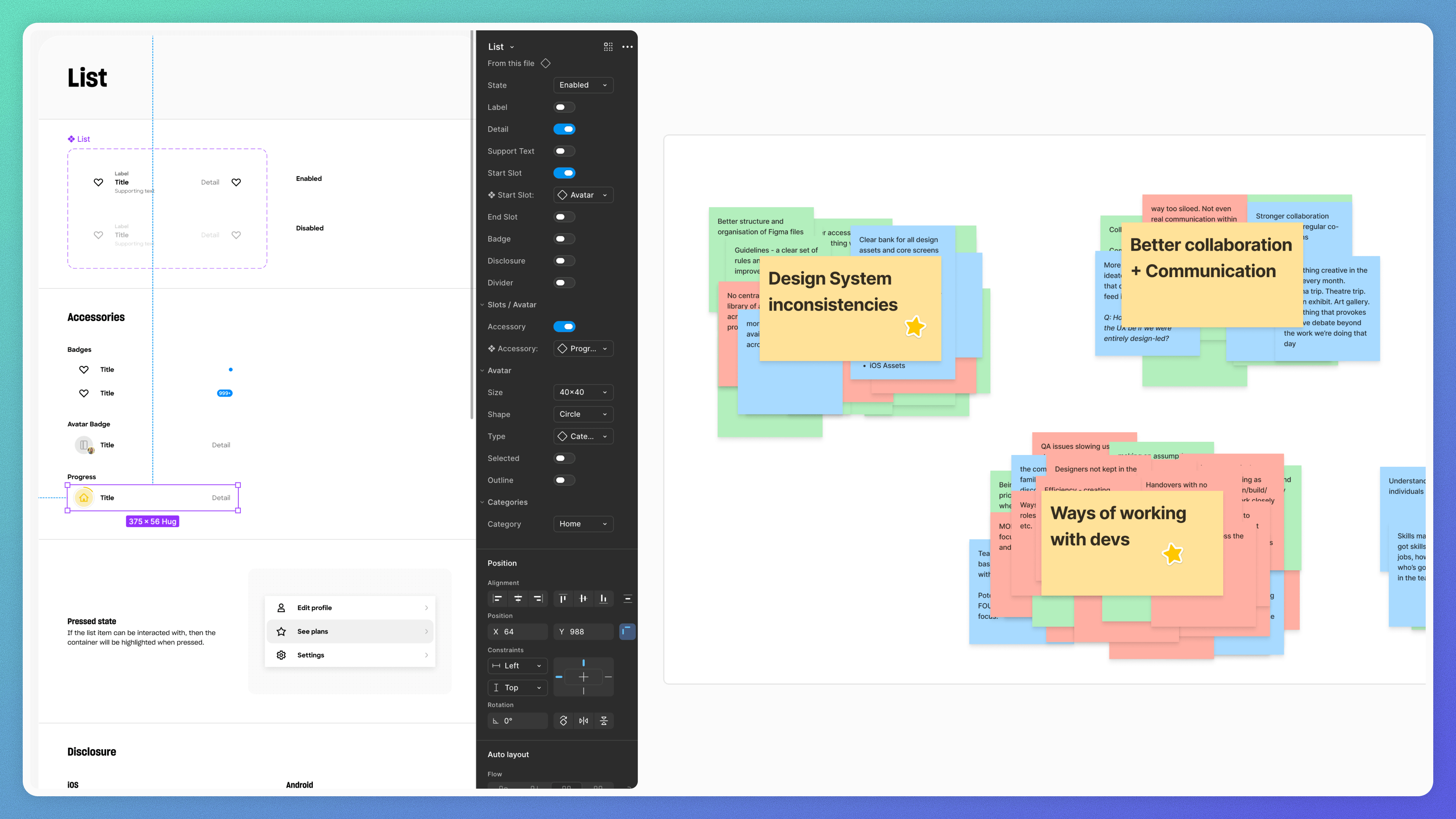
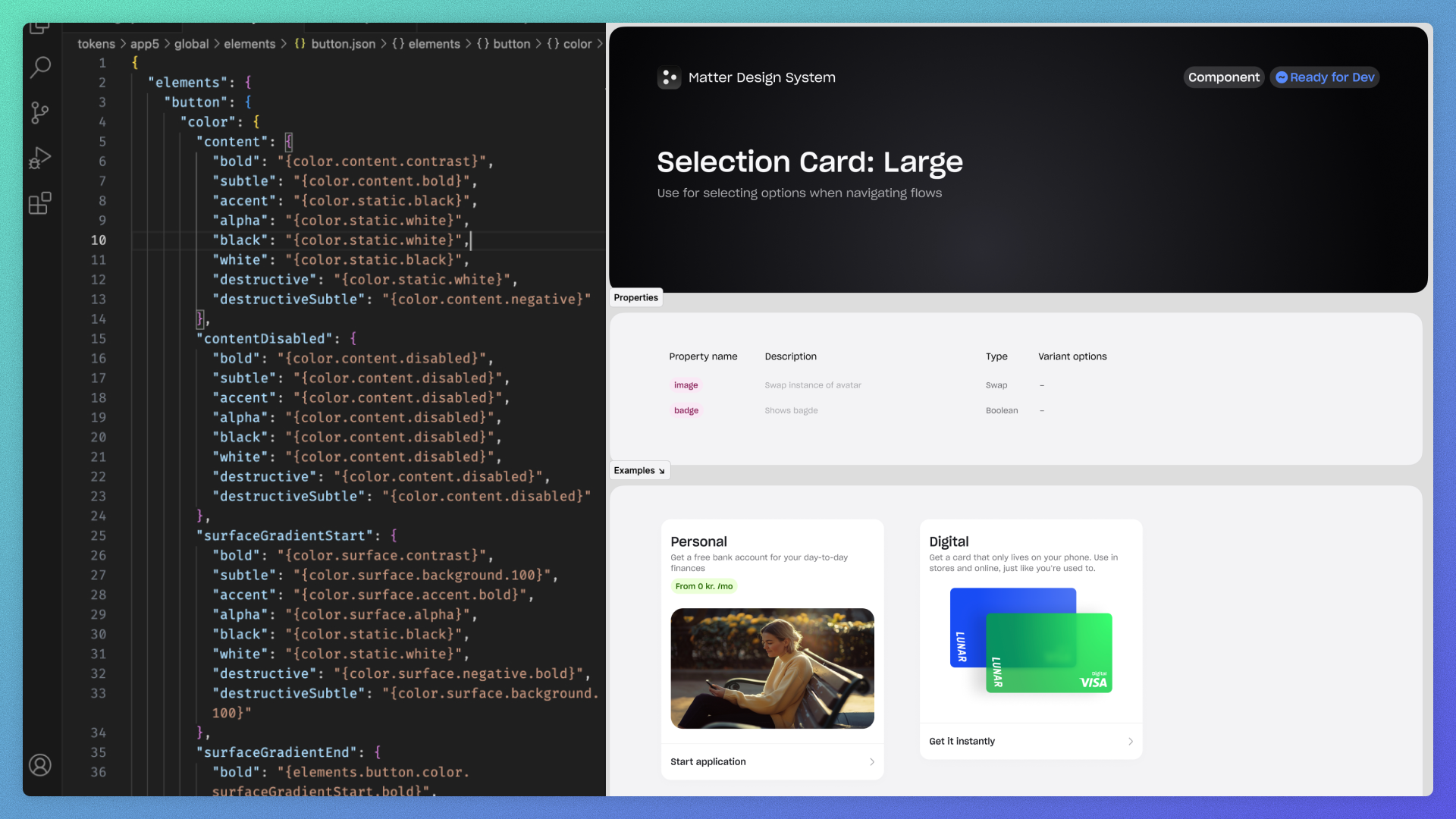
Matter, the System Underneath All of It
Underneath everything you've just seen is Matter. Lunar's design system, rebuilt during this project.
The fix from the diagnosis was structural:
- Simpler primitives, so designers could drag, drop, and move on without fighting the system.
- A token layer underneath, so changes propagated rather than rippling manually.
- Code reflection, so the production app and the Figma library stayed honest with each other.
- A governance model, so the team could evolve it together rather than relying on one designer working alone.
Same source of truth across Figma, iOS, Android, and web, with theming built in, so the system could support Light, Dark, Consumer, Business, Kids, the SAS partnership, and custom expressions for specific surfaces.
Matter did two things that mattered. It gave us velocity in the build phase, because we weren't reinventing components for every screen. And it produced consistency by default: the inconsistencies that had been part of the debt pillar went away not because we policed them, but because the system made consistency the path of least resistance. The same approach informed the design system I'm now building from scratch at Numan.
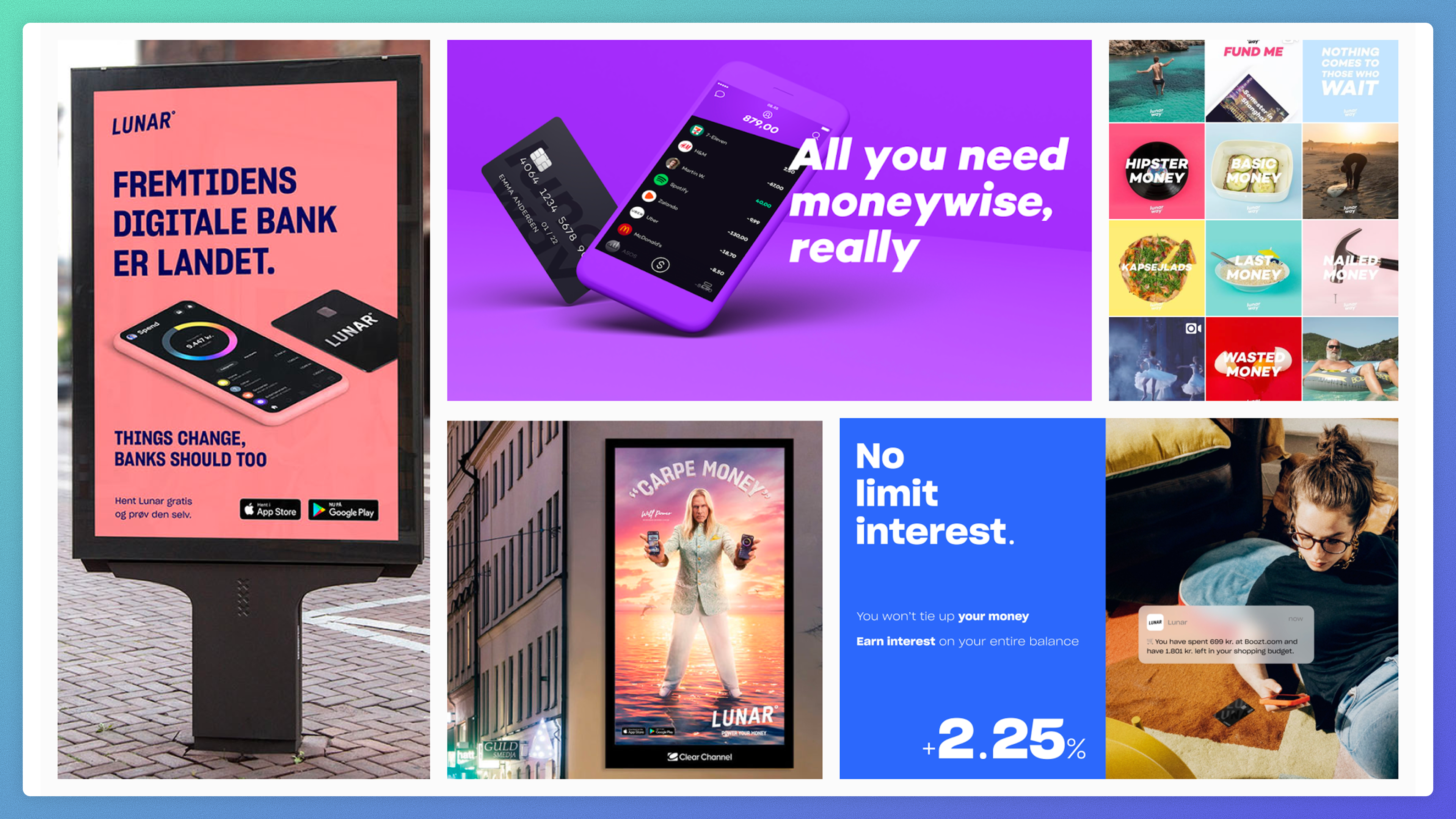
Brand and Product, Back Together
Closing the brand-and-product gap was a deliberate part of the redesign, and one I worked on directly with the brand team. The redesign happened during a brand refresh, which gave us something most companies don't manage: aligning the brand and product moves on the same timeline rather than letting one lead and the other catch up later. The 3D objects and editorial energy that worked on a billboard didn't all translate to a banking app interaction, but the underlying personality did. Confident, clean, distinctive, with moments of warmth.
The system carried this. Matter's token layer was where the brand decisions actually lived, so brand changes propagated rather than rippling manually. When marketing evolved a colour or a treatment, the product could absorb it without designers updating components by hand.
The unexpected part was that this ran in both directions. The product collaboration changed the marketing brand. The way certain motions felt, the way colour resolved at small sizes, the way personality came through in microcopy, all fed back into how the marketing brand subsequently developed. By the end, brand and product weren't running on parallel tracks. They were one system, with the product collaboration shaping the brand as much as the brand shaped the product.
Building and Shipping at Scale
For the rollout, I made a deliberate call to phase it:
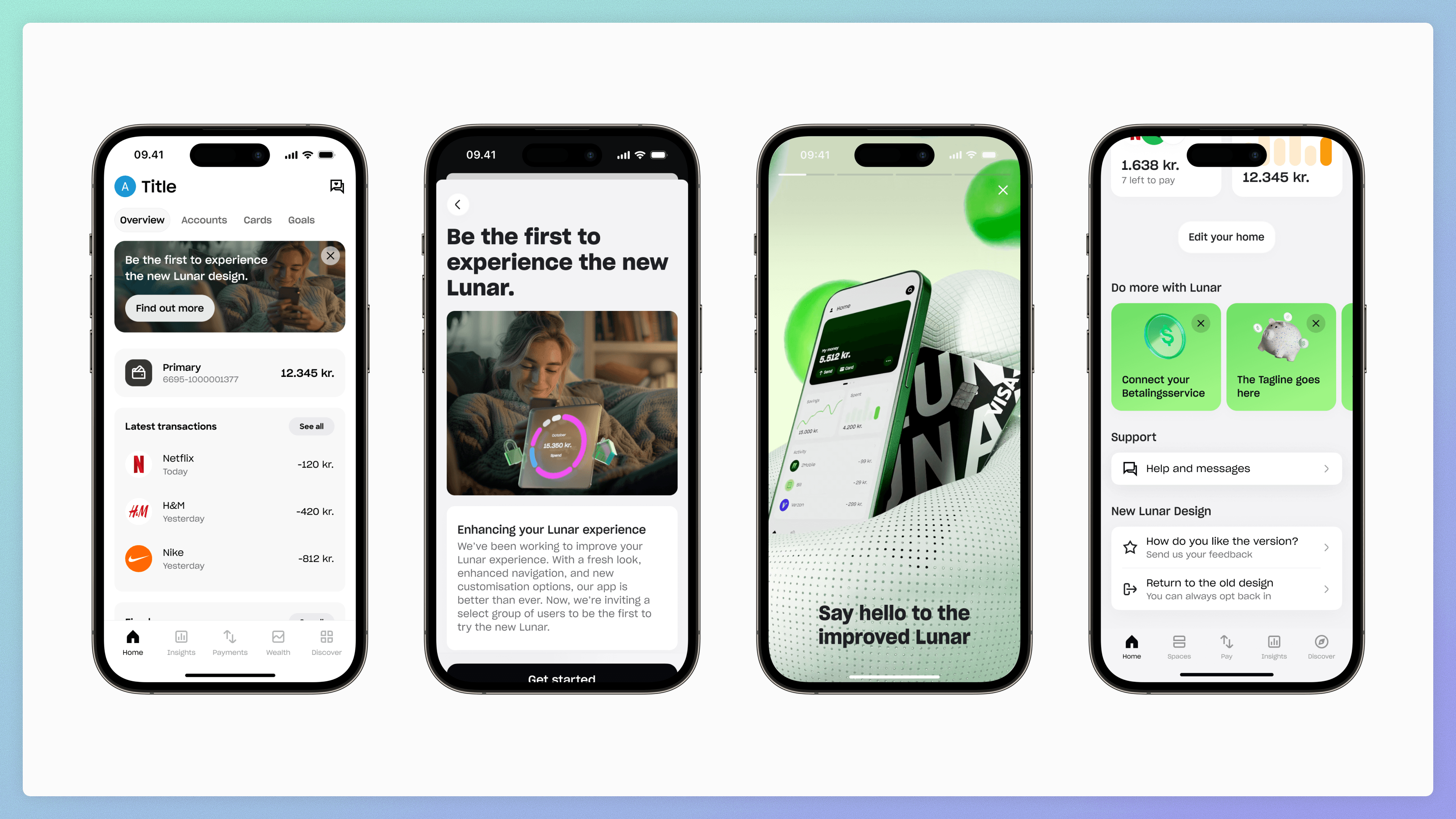
- Internal alpha to employees first, so we could absorb feedback from people who used Lunar daily and could speak fluently about what was working.
- Opt-in beta to 50,000 high-engagement users, invited inside the existing app, with always-on feedback collection and an opt-out path back to the old design. We analysed thousands of feedback points using AI models to surface patterns at speed. Forced rollouts at this scale create resistance. Letting users opt in and out gave us cleaner signal and better feedback.
- A/B testing with new users to validate the new experience against the old.
- Full release once the metrics held.
A note on the timeline. The original plan was a six-month project with a launch before the Danish summer freeze in July. Actual rollout was opt-in beta in August, A/B in September, full release in November. Five months later than planned.
I made the call to extend rather than ship to schedule, against business pressure. The risk of getting this wrong at a million users during a profitability push was higher than the risk of shipping late. I'd make the same call again. Trading timeline for confidence is one of the harder trades to negotiate in practice, but it's almost always the right one for high-stakes work at scale.
What It Changed
The shipped product needed to do one specific thing well. Make Lunar good enough that users would treat it as their primary bank, the one where salaries landed and daily life happened. That was the question the project set out to answer.
It worked. Platform transactions are up 73% year on year, H1 2025 versus H1 2024. People are doing dramatically more inside Lunar. More than half of new users commit to a paid tier within their first week. The business is now earning the majority of its revenue from user activity rather than from interest, which is a structural shift in how Lunar makes money. Banking economics that look like a primary bank, not a side account.
The new app directly preceded Lunar passing 1 million users in early 2025, and the redesign was credited as a key driver in the company's communications around that milestone.
An honest attribution note: the redesign was the most visible product moment during a year of cumulative product, brand, and marketing work that included it. The numbers reflect the broader effort, not the redesign in isolation.
Two organisational outcomes worth naming alongside the numbers. The new app became the basis for everything that followed: every feature squad now builds inside the new architecture. And Matter has held two years on, supporting the Kids product, the SAS partnership, and the business app, without needing a rebuild.
Three Reflections, With Hindsight
Scope. We did IA, brand, system, and build foundations in parallel. That gave us coherence, four moves landing as one thing rather than four sequential refits. But it also made the project fragile. The original scope was already ambitious for what the org could absorb. Then it grew, because each milestone we hit produced more appetite from leadership. Success expanded the brief. With more flexibility I'd have sequenced these moves rather than parallelised them, and I'd have held scope harder against the appetite for expansion. The trade-off was right for Lunar's specific moment, but it's not a shape I'd recommend by default.
The relationship between user feedback and timeline pressure. Lunar wasn't yet mature in absorbing user feedback and iterating on it at speed, so the testing phases ran longer than planned because we kept finding things we needed to act on. I'd build that maturity earlier next time. The redesign was the wrong moment to also be teaching the org how to receive and act on user research.
Pre-aligning with leadership on what "ready to ship" meant. There were several moments where the right call was to extend the timeline against business pressure. I made those calls and I think they were right, but they cost political capital. With a do-over I'd build earlier alignment on the testing thresholds we'd hold to, before the pressure arrived, rather than negotiating them in real time.
Outcomes
- Platform transaction volume: +73% year on year. Users doing dramatically more inside Lunar.
- ARPU: +12% across personal and business banking, with revenue mix shifting structurally away from interest income.
- Paid tier conversion: 1 in 2 new users on a paid tier within their first week.
- Navigation-related support calls: −41%, scoped specifically to the IA and navigation fix.
- Scale and quality: Preceded Lunar passing 1M users across Denmark, Sweden and Norway. App store rating moved from 4.2 to 4.7.
Outputs
- A reframed brief: Diagnosed the project as a primary-bank rebuild rather than a surface redesign, and built leadership alignment around three structural problems (ownership, debt, brand) that had to be solved together.
- A new product architecture: Daily versus situational split as the organising principle. Seven rounds of low-fidelity prototyping, four concept directions plus a deliberate fallback, and a pivot that killed an ambitious pattern (Spaces) while keeping the thinking that made it work.
- Matter design system: A rebuilt token-backed system with code reflection, governance, and theming, supporting Consumer, Business, Kids, and the SAS partnership without rebuild two years on.
- Brand and product in one system: Brand decisions held at the token layer, so changes propagated rather than rippling manually. The product collaboration shaped the brand as much as the brand shaped the product.