Outcomes
- Velocity: Re-skin, new website, and new app shipped simultaneously inside five months, against the May brand campaign deadline. A pace Numan had never previously achieved.
- Team health: The system was cited directly in team health surveys as a reason for better collaboration, more confidence in the work, and improved time to market.
- Retro shift: The design system had been the number one issue in design team retrospectives for multiple quarters. It no longer appears.
- Expanding adoption: Now being extended to marketing and CRM following early adoption success across the product squads.
Outputs
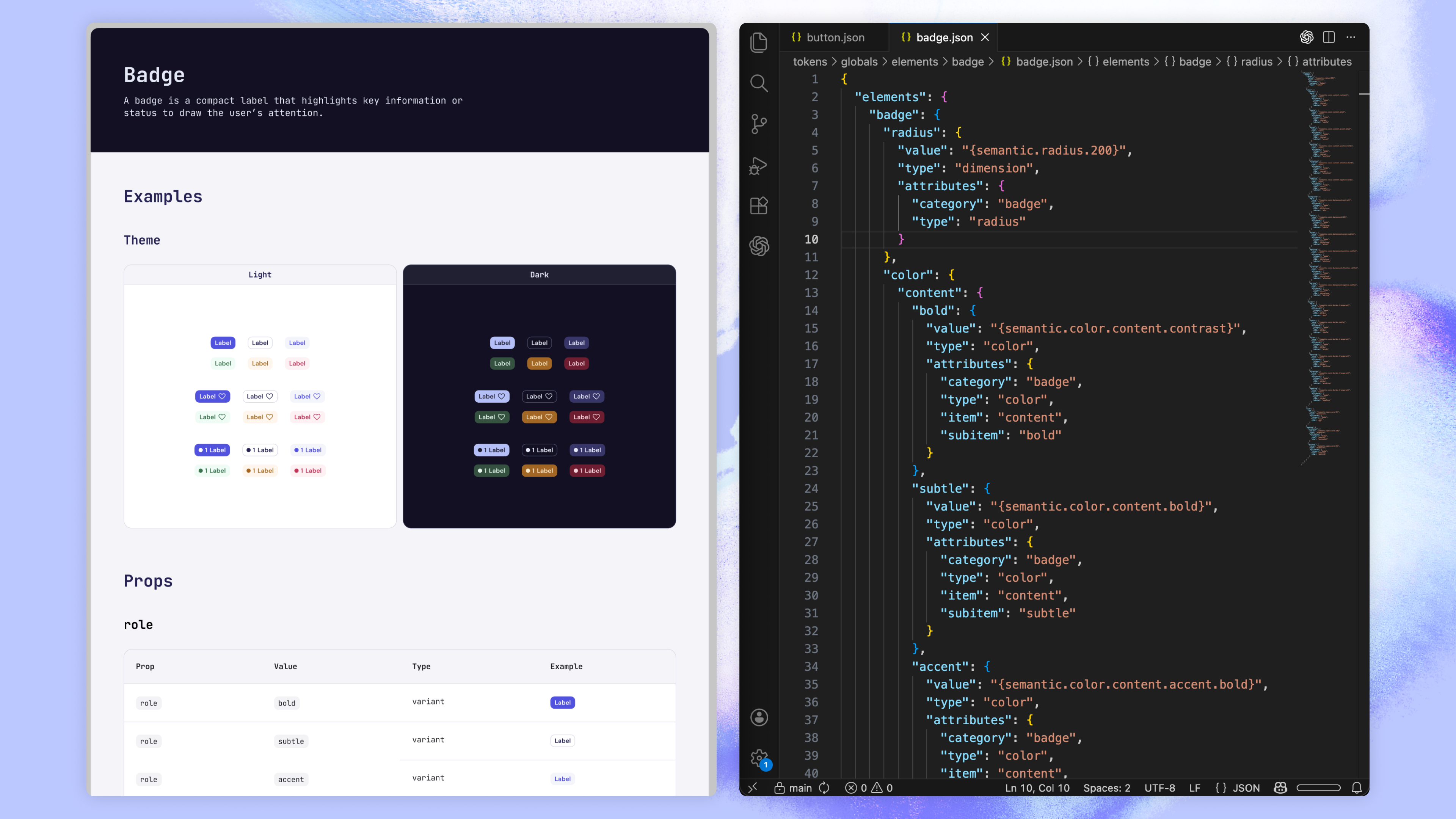
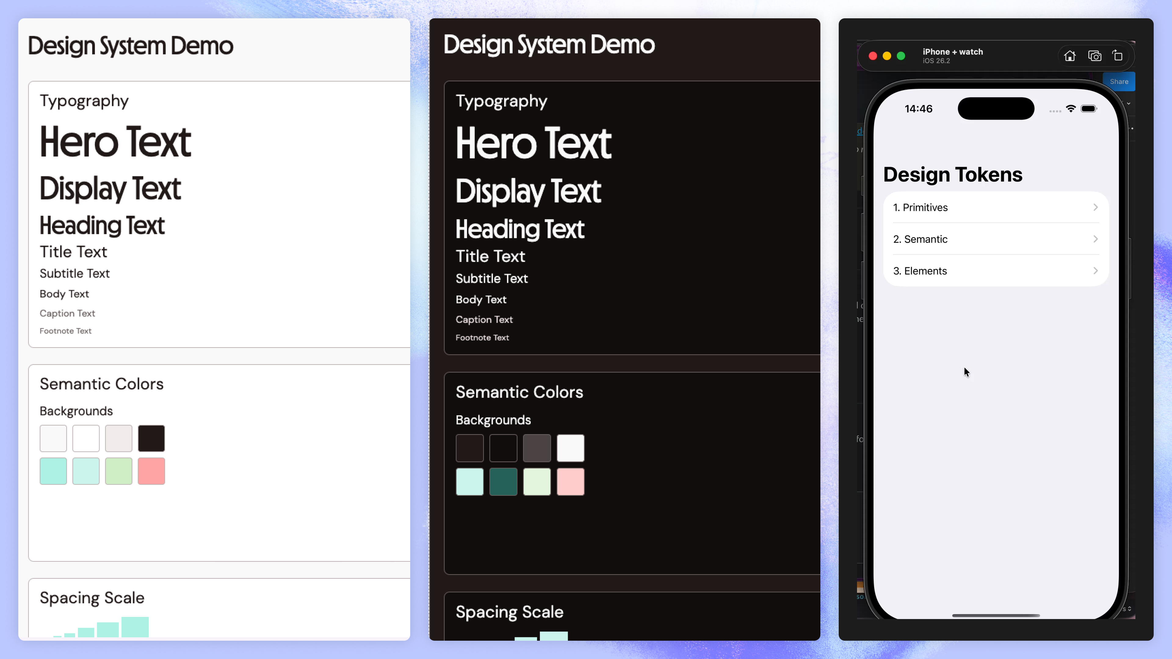
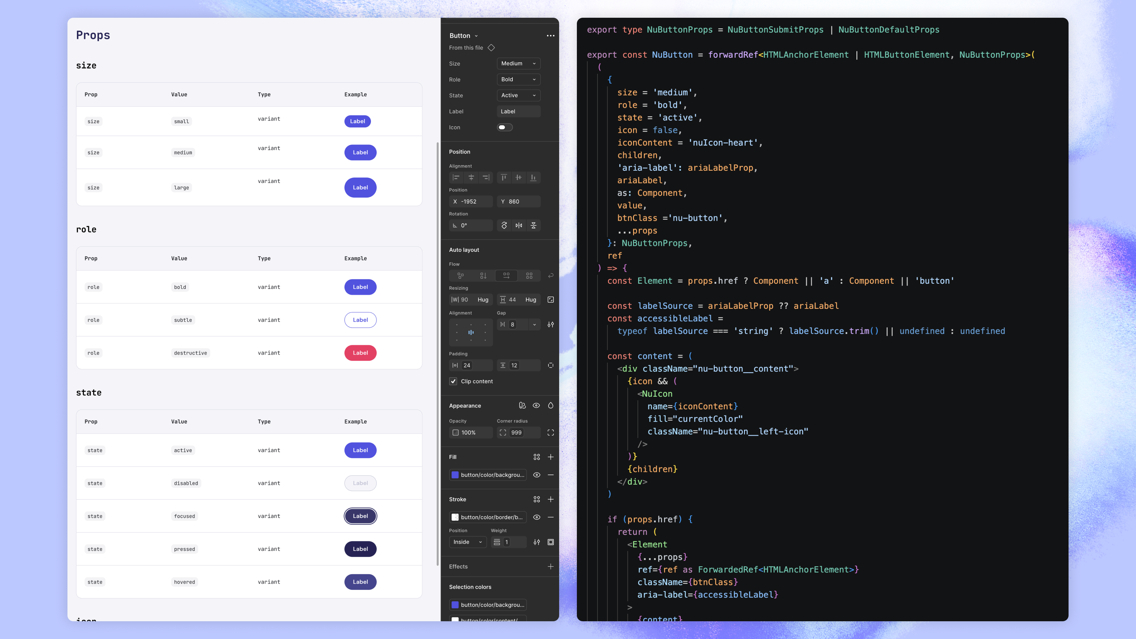
- Token architecture in code: A cross-platform Style Dictionary repository with Figma REST API sync, generating versioned outputs for web, iOS, and Android. Source of truth shifted from Figma to code.
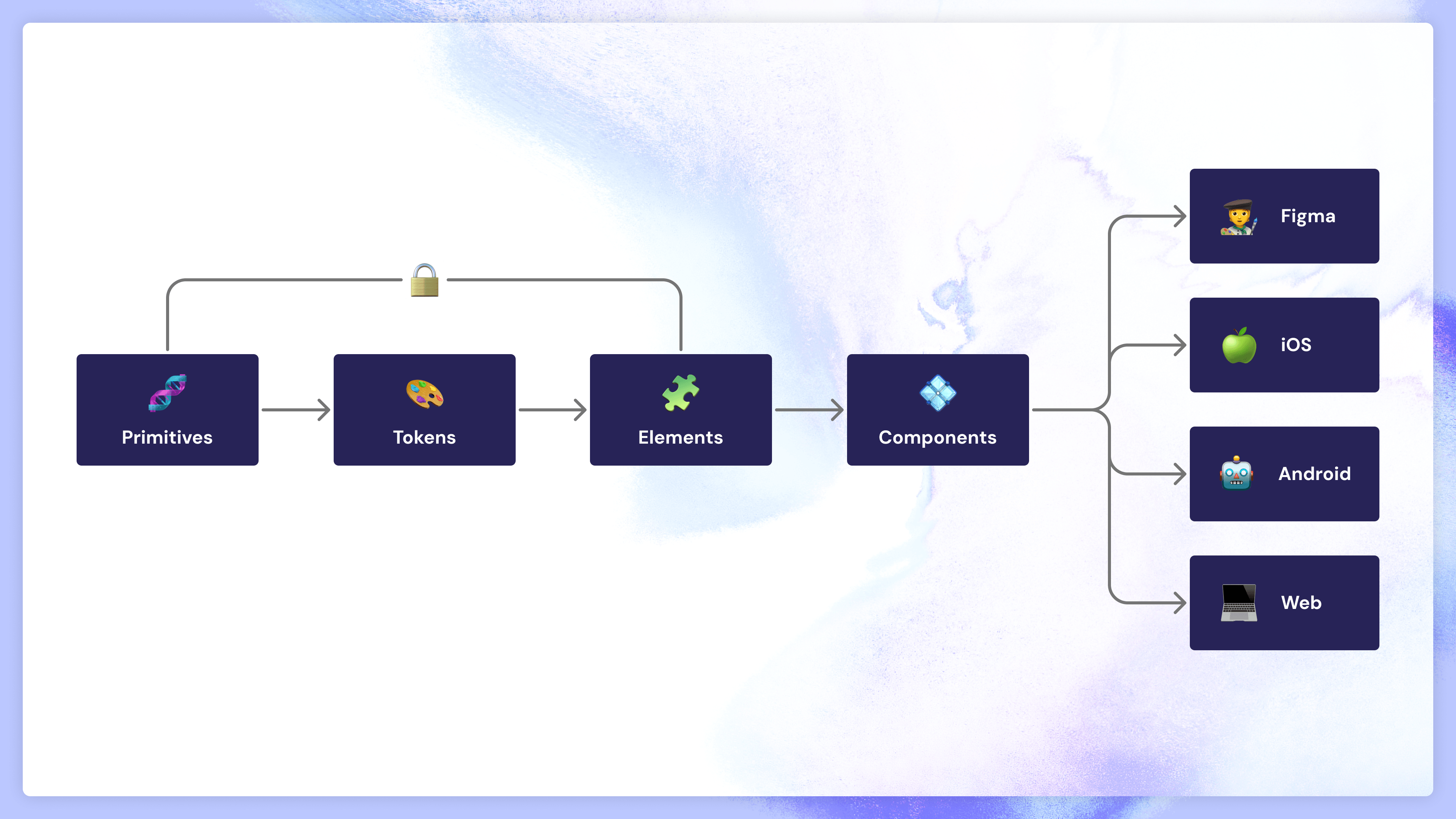
- Five-level system: Primitives, Semantic Tokens, Elements, Components, and Templates. Each layer with defined ownership and governance.
- Design System Guild: Cross-functional team spanning design, brand, web, iOS, and Android. Shared backlog managed through GitHub and JIRA, with governance held at the guild level.
- Figma library and Code Connect: Documented components mapped one-to-one to their code equivalents. Naming alignment made load-bearing through Code Connect, so handoff annotation became part of the system itself.
What is Numan?
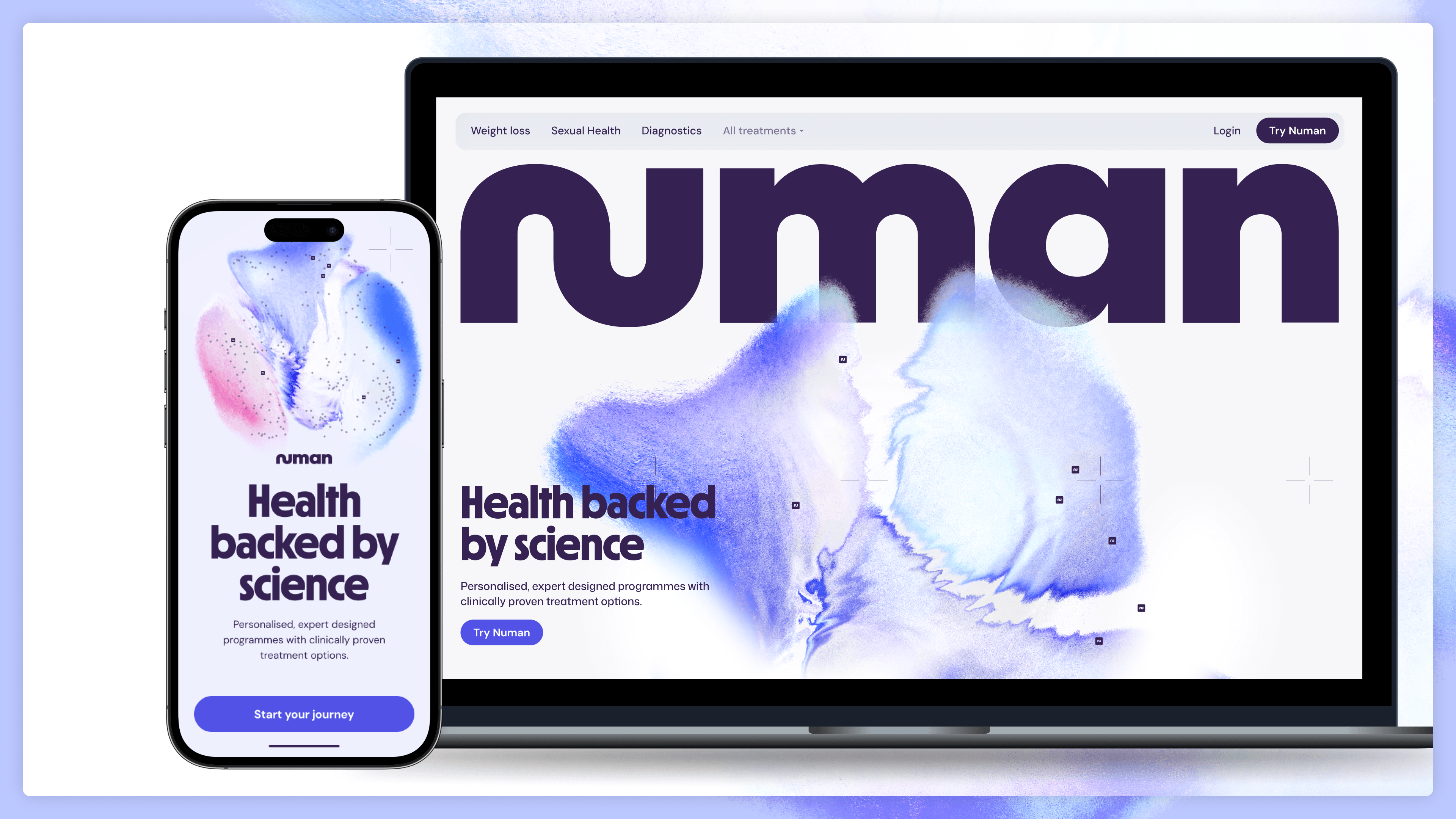
Numan is a UK health tech company, transitioning from a transactional e-commerce pharmacy model toward a broader subscription health platform. That shift required a complete rethink of the end-to-end patient experience across web and native app, and it needed to land alongside a major brand repositioning. Different proposition, different visual language, new product surfaces, on a hard timeline tied to a May brand campaign.
That's the context that made the design system urgent. Not a quality-of-life improvement for designers. The infrastructure the rebrand and the new patient experience were going to be built on.
My Role
Head of Product Design at Numan from 2024. On this project I led the design system from end to end as a hands-on contributor: business case, guild formation and chairing, architecture, Figma library, Style Dictionary repo in code, governance model.
Design operations is a core part of how I approach design leadership, and the skills and capacity to build this properly weren't available across the existing teams. So rather than wait for a hire or delegate to people who hadn't done it before, I set the initial system up myself across design and front-end, leaning on my background as a front-end developer. Leading by example earned faster buy-in than telling, and it left me with deep enough technical knowledge to govern the system credibly afterwards.
Three Systems, No Shared Language
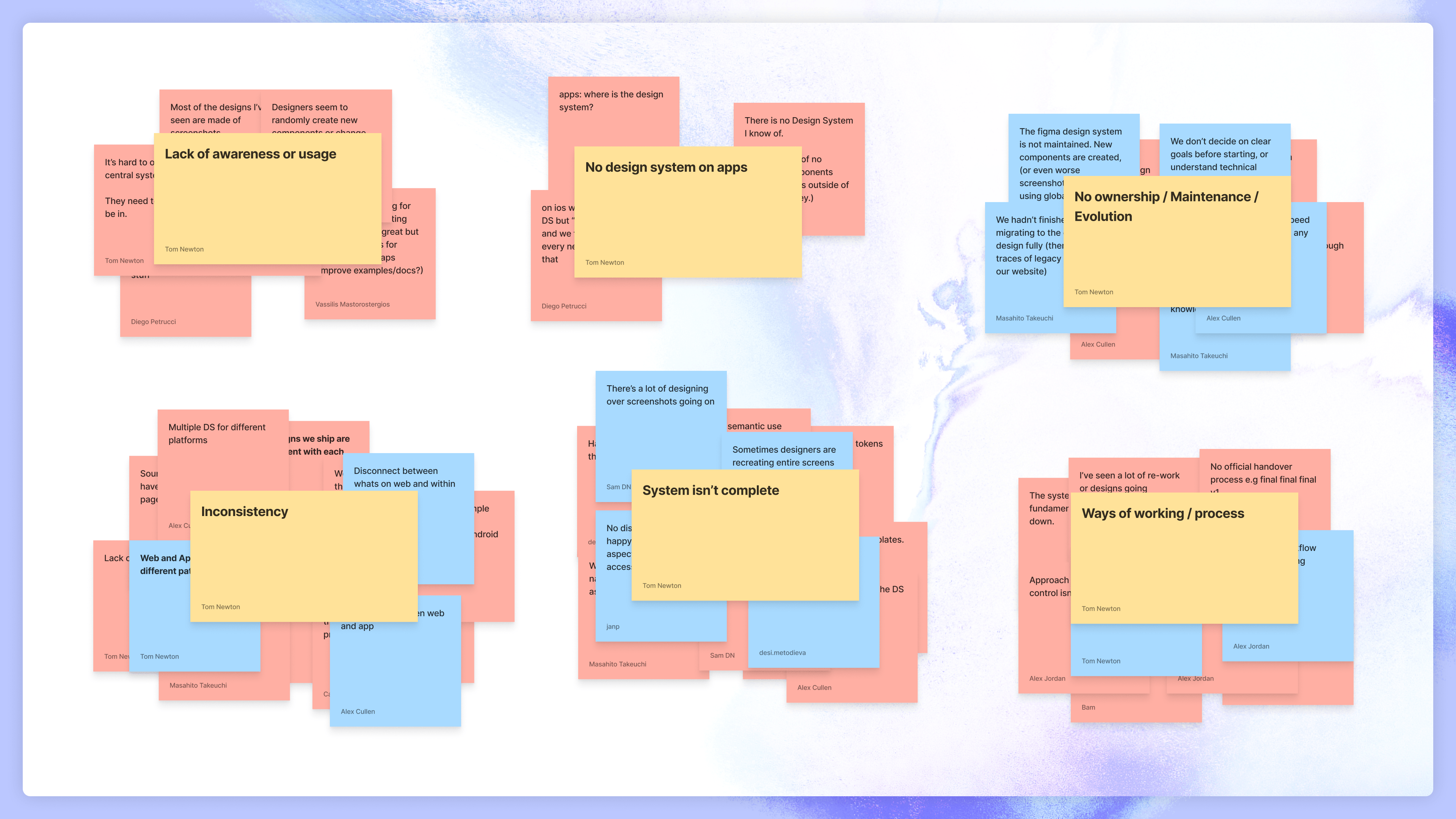
My first weeks at Numan made the problem visible quickly. Designers were spending most of their time in Figma recreating components and screens from scratch on every project. The team had a small component library but it had fallen far enough behind that they couldn't rely on it. They were using screenshots in their prototypes instead of live components. Every design that left the team was effectively a one-off.
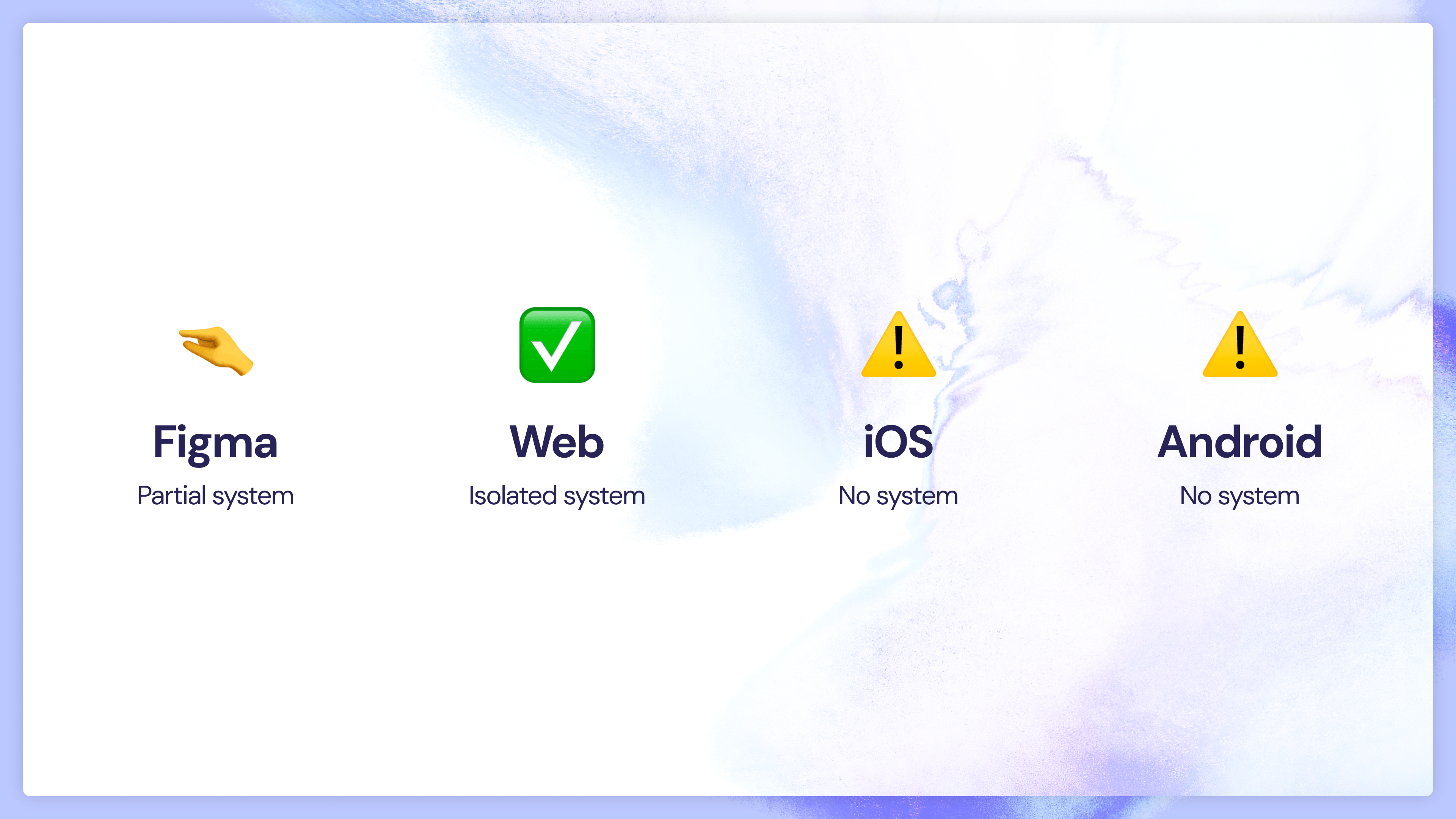
The front-end web team had their own system built in Storybook, created in isolation primarily to speed up their own development. No design involvement, no shared documentation. The app developers had no system at all. Experiences differed across iOS, Android, and web in ways nobody had a full picture of, and the codebases were full of hardcoded values.
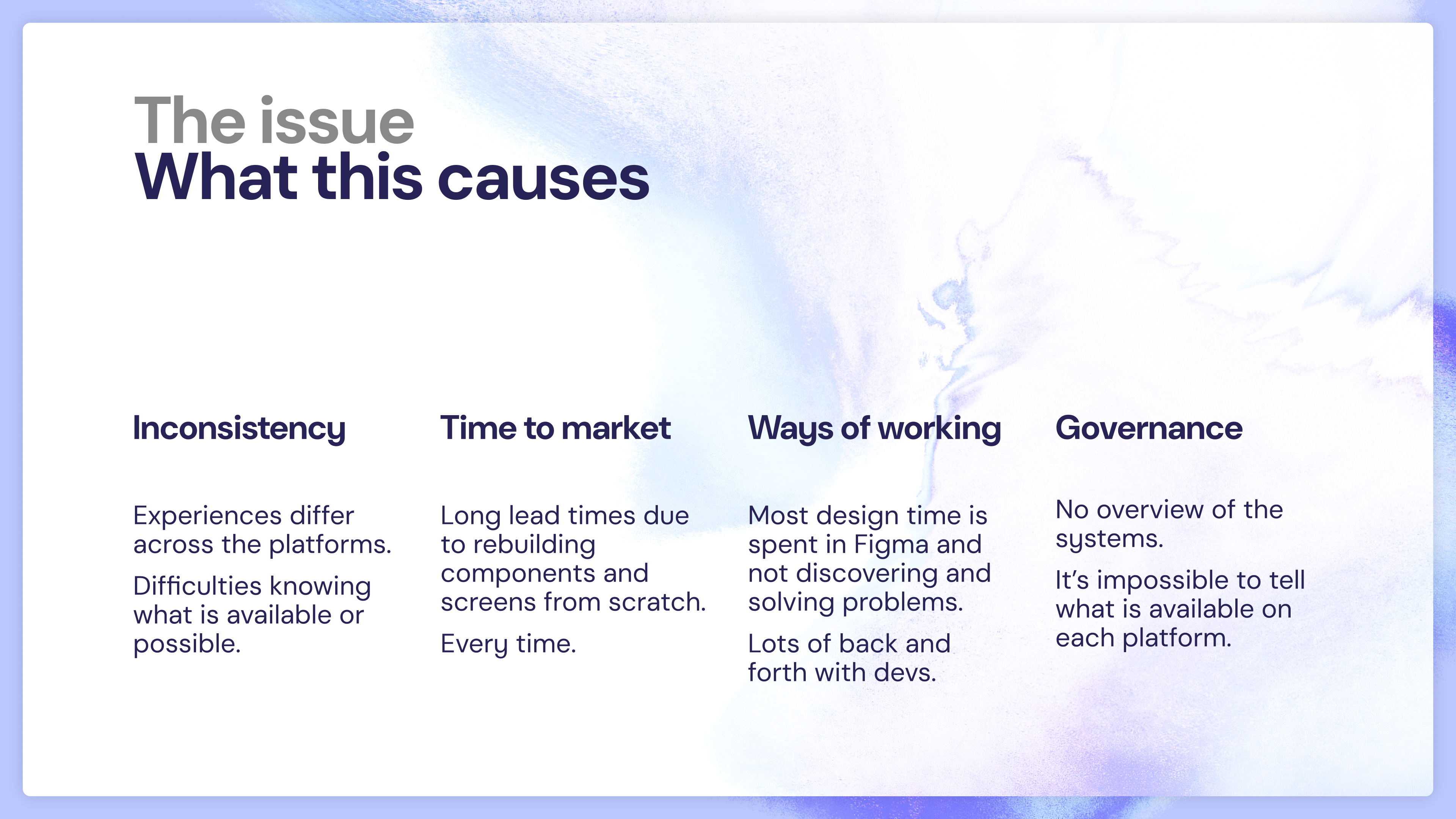
These three systems had grown independently, each serving one team's immediate needs, with no common language between them. The business impact was real: slow time to market, constant rework between design and engineering, inconsistent patient experiences, visible frustration across the org. When I looked at the design team's quarterly retrospectives, the design system appeared as the number one issue, quarter after quarter.
The diagnosis broke into four causes, and I kept this framing because it's how I sold the case internally:
Inconsistency. Experiences differed across platforms and nobody had a full picture of what was available where.
Time to market. Lead times were long because every project rebuilt components and screens from scratch. Every time.
Ways of working. Most design time was spent in production mode in Figma rather than discovering and solving problems. Lots of back and forth with developers.
Governance. No overview of the systems. Impossible to tell what was available on each platform, or who owned what.
The Window
Retrofitting a design system onto a live product mid-flight is significantly harder than building one as part of a platform shift, and Numan was about to do a platform shift. The rebrand and the new patient experience created a natural window to build the foundations before the new experience went into production, not after. If the system wasn't ready when those streams arrived, the work would happen on top of the old fragmented systems and we'd be retrofitting within the year.
I'd built systems like this before at Auto Trader, eBay, and Lunar, evolving the architecture each time to fit the context. At Numan the shape of the problem was familiar; the absence of anyone with experience working this way was the compounding factor. There was no shared model to build on, which is part of why I made the call to set the system up personally rather than delegate or hire for it.
Forming the Guild
Rather than owning the system inside design, I formed a Design System Guild: myself as design lead, a tech lead, a brand and visual designer, a web developer, an iOS developer, and an Android developer. A system built only by designers would repeat the mistakes of the Storybook system, useful for one team and invisible to everyone else. The guild model was the structural antidote.
Selling the case took two moves. With C-level leadership, I connected the business issues they already felt (slow delivery, inconsistent product, poor morale) to their root causes in the fragmented systems. They'd felt the symptoms without understanding the diagnosis. With engineering, several developers were sceptical that a shared system would reduce their workload rather than add to it, so I built the first technical demo myself, writing the token library in code and walking them through how it would change their day-to-day workflow. Scepticism turned to buy-in once the system was working in their own language. That set the pattern for how the guild operated afterwards: ship the working thing, then explain it.
Architecture
The system is built on a five-level architecture refined across multiple organisations: Primitives, Semantic Tokens, Elements, Components, and Templates. Each layer builds on the last, and each has a defined audience and governance model.
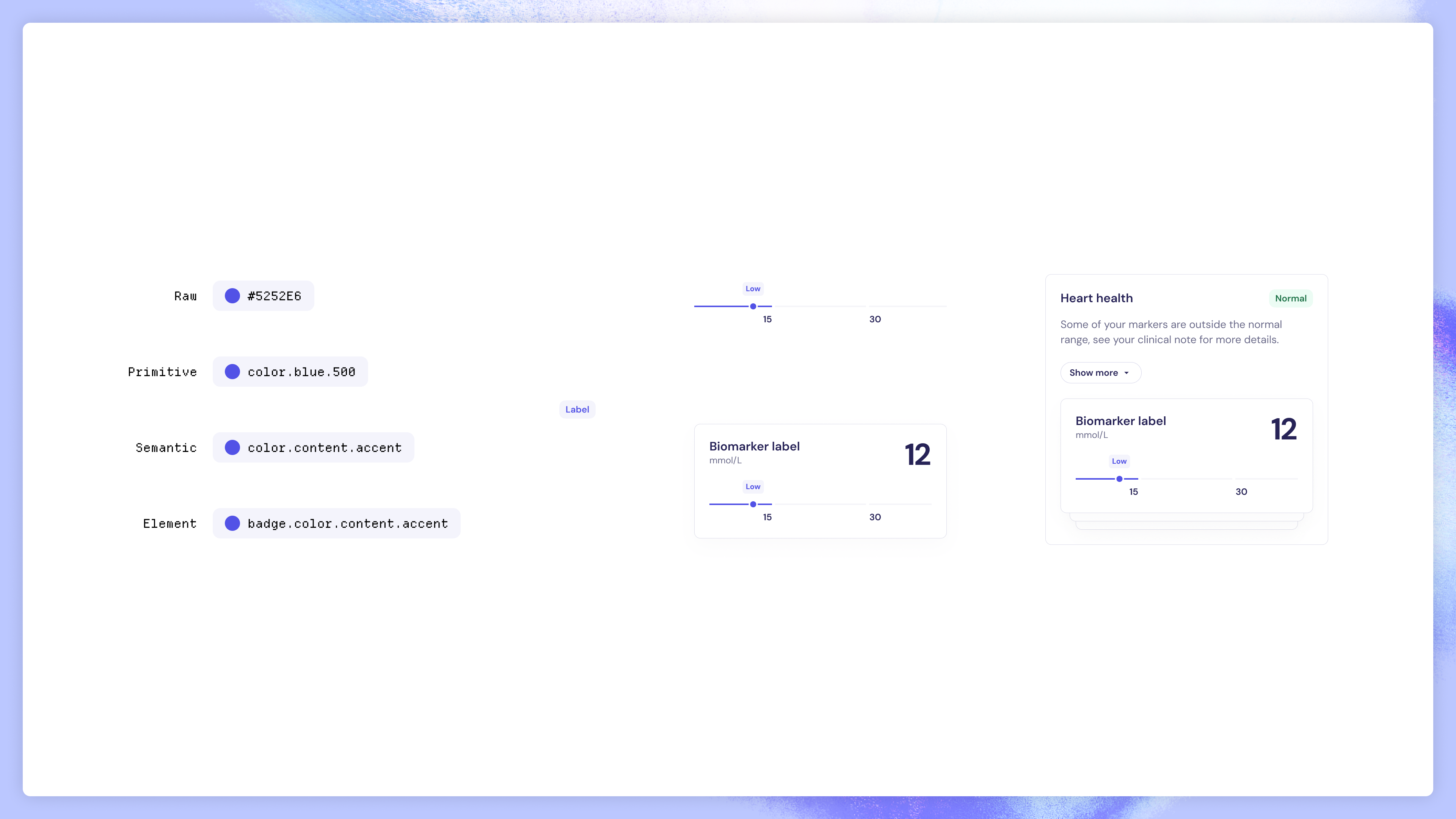
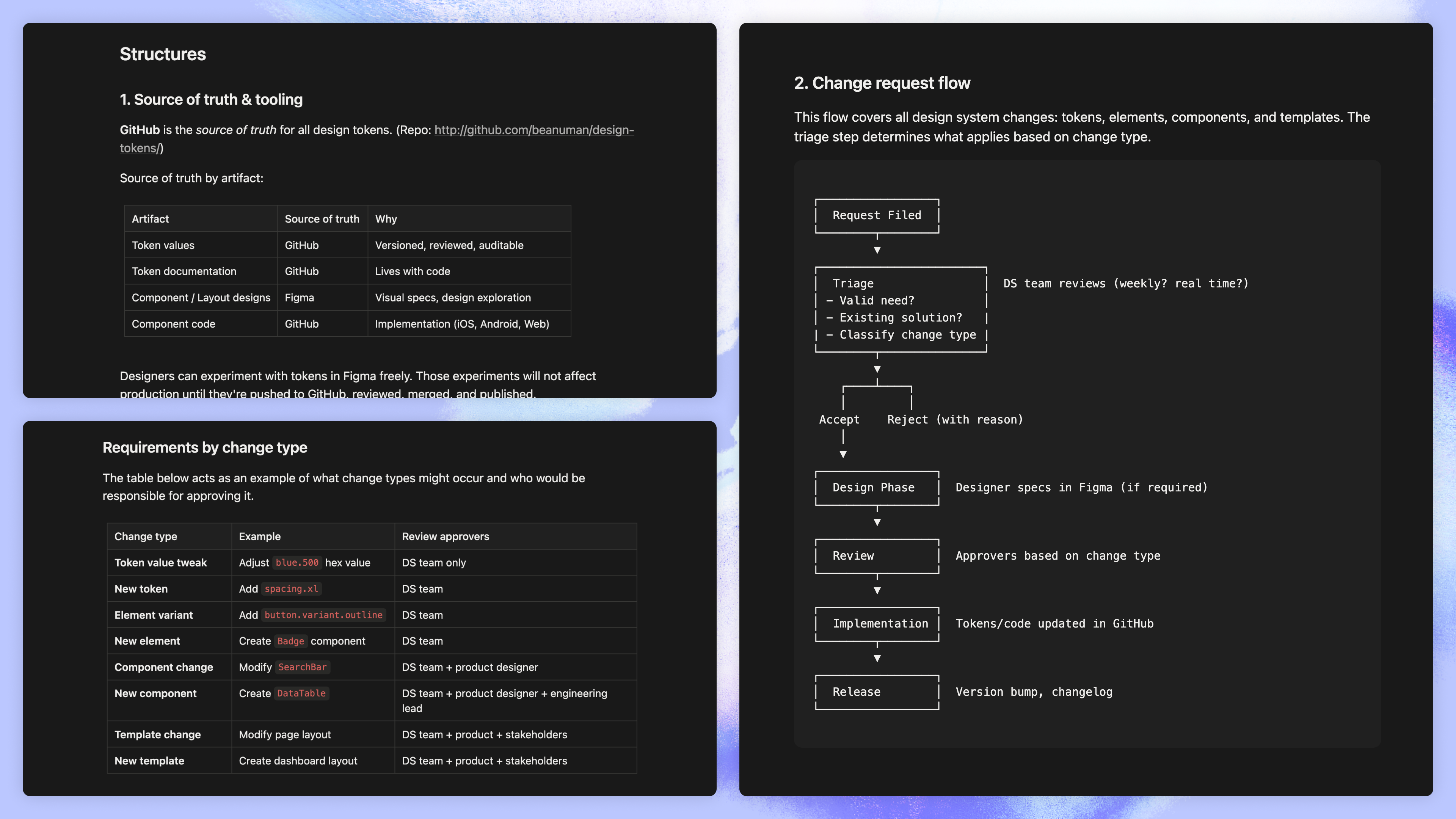
Token management sits at the foundation. I wrote the Style Dictionary configuration myself, managing tokens in a repository and using the Figma REST API to sync changes bidirectionally. This was a deliberate decision to shift the source of truth from Figma to code. Figma is a design tool, not a governance system: values drift, ownership is unclear, accessibility testing is limited. With the token repo as the source of truth, every change is versioned, reviewable, and distributed consistently to iOS, Android, and web as part of the build process.
The semantic token layer is worth calling out specifically. Rather than exposing raw values, tokens carry intent: backgrounds, content, borders, surfaces; positive, negative, attention; with explicit light and dark variants. Identical naming across every platform. The tokens communicate what something is for, not just what it looks like.
Built for AI From the Start
The decision to make the system token-driven and code-first was motivated primarily by governance and platform parity. AI legibility was a downstream benefit, not the originating driver. But it was a benefit I designed for deliberately once the architecture was clear.
Because the design language lives in a structured token repository rather than buried inside Figma files, it's directly consumable by large language models. Designers and PMs use Claude to generate working prototypes against the real system, not generic placeholder UI but layouts and components that already conform to Numan's design language. On the Figma side, the component library is plugged into Figma Make, so AI-generated screens start from the correct foundations rather than producing generic output that needs reconciliation. A system that's only usable by the designers who built it has a ceiling; one that's legible to AI tooling doesn't.
Fewer Choices, Not More
One of the most deliberate decisions in the system was to give designers less, not more. Counterintuitive, but it addressed a specific problem I'd observed: designers were spending most of their time in production mode, toggling props and building screens, rather than discovering user needs and solving problems.
The guild model provides the mechanism. Only guild members have access to the primitive and semantic token layers. Designers and developers work primarily at the component layer, where the hard decisions have already been made, with pre-made curated variants covering the most common use cases. Asset management lives inside the system too, with the regulatory-approved asset library available directly within component props, so no one accidentally reaches for a non-compliant image. The goal wasn't infinite flexibility. It was confidence, speed, and freeing up time for the work that actually matters.
Naming, Parity, and Cross-Platform Alignment
The most persistent friction point between design and engineering was naming. What things were called in Figma versus in code: different names, different prop structures, different behaviour. Every handoff was a translation exercise. We resolved this by aligning naming, props, and component structure across the entire system. Every design component maps directly to its code equivalent. What you name in Figma is what you call in the component library.
This alignment is reinforced through Figma Code Connect. Design components are mapped to their code implementations, so developers inspecting a design in Figma see real component usage and accurate prop names rather than auto-generated guesses. Handoff annotation that used to require manual documentation is now part of the system itself. Code Connect didn't introduce the naming alignment; that work had to be done first. But it makes the alignment load-bearing in a way that documentation alone couldn't sustain.
Phased Rollout, Not a Big Bang
The temptation with a new system is to wait until everything is ready and reveal it as a single moment. That maximises coherence but also maximises risk: anything wrong shows up everywhere at once, and the rebrand timeline didn't have room for a wholesale failure. We rolled it out across three streams running in parallel, each consuming the same token foundation at different depths:
- Re-skin first. Token layer applied to the existing marketing site and email templates, giving the new brand its first public surface without rebuilding anything underneath. Marketing paid social and emails were using the new system within weeks. Low risk, fast feedback, brand team unblocked early.
- New website next. Built on the existing web design system and CMS, but with the new visual language and the full token set applied. This is where the token-driven sourcing earned its keep: the new web system inherited from the same tokens marketing was already using, so coherence was structural rather than enforced through review.
- New app last. A full new app design system from scratch, built on the new foundations. Staged rollout over H2 rather than a single launch moment, so issues surfaced incrementally rather than all at once.
Each stream shipped to its own timeline, but all three were structurally compatible because they shared the same tokens and the same semantic vocabulary. That parallelism is what made the under-five-months number possible. None of those streams could have shipped that fast in isolation.
What It Changed
Re-skin, new website, and new app delivered simultaneously in under five months, against the May brand campaign deadline. Faster than any comparable project in Numan's history, because teams spent their time building rather than rebuilding.
The system was directly referenced in team health surveys as a reason for better collaboration, more confidence in the work, and improved time to market. The quarterly retrospectives no longer feature the design system as a complaint. That shift on its own would be a meaningful outcome.
Adoption is now extending to marketing and CRM, reflecting demand from teams adjacent to product rather than top-down rollout. Issues and contributions are managed through GitHub and JIRA, with the guild maintaining governance across the backlog.
Two Reflections
On building the system personally. Setting the initial system up myself, including writing the Style Dictionary repo, was the right call for Numan's specific context. There wasn't anyone with the experience to do it credibly, and waiting for a hire would have missed the rebrand window. But it's not a default I'd recommend. The cost is that the system carries my fingerprint heavily in its first version, and the long-term health of any system depends on it outgrowing its original author. The guild model is the mechanism for that, and the test of whether I got the balance right will be how much the system evolves once I'm not the person closest to its code.
On the AI-first framing. I designed for AI legibility deliberately, but I want to be careful not to retrofit it as the originating reason for the architecture. The architectural decision was token-driven and code-first sourcing, made for governance and platform parity. AI legibility was a benefit that fell out of that decision once I recognised it. A system built primarily for AI legibility would be at the mercy of how AI tooling evolves. A system built for governance that happens to also be AI-legible compounds across both axes.
Outcomes
- Velocity: Re-skin, new website, and new app shipped simultaneously inside five months, against the May brand campaign deadline. A pace Numan had never previously achieved.
- Team health: The system was cited directly in team health surveys as a reason for better collaboration, more confidence in the work, and improved time to market.
- Retro shift: The design system had been the number one issue in design team retrospectives for multiple quarters. It no longer appears.
- Expanding adoption: Now being extended to marketing and CRM following early adoption success across the product squads.
Outputs
- Token architecture in code: A cross-platform Style Dictionary repository with Figma REST API sync, generating versioned outputs for web, iOS, and Android. Source of truth shifted from Figma to code.
- Five-level system: Primitives, Semantic Tokens, Elements, Components, and Templates. Each layer with defined ownership and governance.
- Design System Guild: Cross-functional team spanning design, brand, web, iOS, and Android. Shared backlog managed through GitHub and JIRA, with governance held at the guild level.
- Figma library and Code Connect: Documented components mapped one-to-one to their code equivalents. Naming alignment made load-bearing through Code Connect, so handoff annotation became part of the system itself.